RATE THIS EXAMPLE FROM "BENEFICIAL" TO "HARMFUL"
BENEFICIAL HARMFUL
Translate to other languages
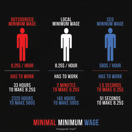
Minimum Wage Comparison Infographic
Background Information
A poster looking at minimum wage from "Propaganda Times" website.
Technique Used
Simplify Ideas
This is propaganda because
This poster is trying to show in simple terms that the people who do the outsourced labor get little money. It breaks it down into only three different categories. However, no information is shown about the kind of work done or training and education (investment) needed for minimum wage and CEO pay. It also does not account for costs of living, etc. Not only are these concepts simplified, the source of data is not displayed.
Source
Propaganda Times

Share Your Ideas
Share this content