RATE THIS EXAMPLE FROM "BENEFICIAL" TO "HARMFUL"
BENEFICIAL HARMFUL
Translate to other languages
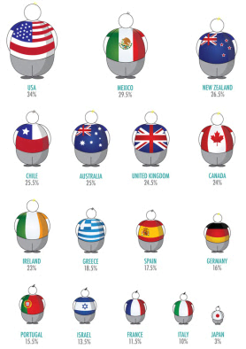
Infographic Compares National Body Mass Average
Background Information
This is an "infographic" about obesity in different countries.
Technique Used
Respond to Audience Needs
This is propaganda because
It is looking at percentage-wise how many people in each country are obese, appealing to people's desire to be considered healthy and fit compared with others.

Share Your Ideas
Share this content